Zoom scroll effects are quite cool to incorporate into your designs. However, for many newbies to frontend development, this can feel like a bit of an execution mystery.
In this tutorial, we are going to go over how to make a cool scroll zoom effect with a few lines of JavaScript and a dash of CSS. This is the write-up part for the video below. Don’t forget to like and subscribe 😉
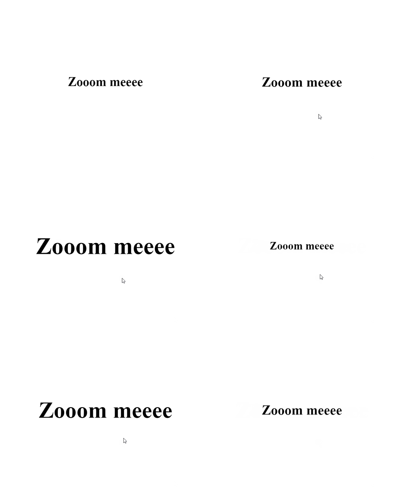
This is what we’re going to be making:
How scroll zoom works
The idea behind this little effect is simple:
- if you scroll down, the targeted element is zoomed in.
- if you scroll up, the targeted element is zoomed out.
To do this, we are going to be using the transform property from CSS and dynamically target it via the scroll event in JavaScript.
Let’s start with the HTML:
<div class="zoom">
    <h1>Zoom meeeee</h1>
</div>
It’s pretty basic. Nothing much. Just a container div with the class zoom attached to it. You can call it whatever you want.
Next up is your CSS. We are going to center and fix position your div so it doesn’t run away when we scroll up and down the page. Here is the CSS:
.zoom{
    height:100vh;
    width:100%;
    display:grid;
    place-items:center;
    position:fixed;
    top:0;
    left:0;
}
And that is the general basic set up for you HTML and CSS. Now for where the magic happens — the JavaScript.
First, we are going to target your zoom class via document.querySelector .
const zoomElement = document.querySelector(".zoom");What’s going to happen is this:
- every time the user scrolls their mouse wheel, the style
transform:scale(1);is going to dynamically change.
This means that 1 needs to be represented in some form in our JavaScript. Let’s create a variable called zoom to hold it.
let zoom = 1;The next part that we need a value that’s going to cause the change. This number is going to be added and deducted to and fromzoom . In our example, we are going to call it ZOOM_SPEED .
const ZOOM_SPEED = 0.1;Now that we have all our necessary values, let’s get onto dealing with the event. To do this, you can use document.addEventListener() . This takes in two parameters — the trigger event and what happens when the trigger occurs.
document.addEventListener(trigger, doSomething());In our case, our trigger event is the scroll event. So our document.addEvventListener() ends up looking something like this:
document.addEventListener("wheel", function(e){});The e is the callback parameter from the trigger that just occurred and gives you what the state of the page is currently at. Within e , there is a parameter called deltaY , which tracks the current position of the vertical axis of the page. This will come in handy for our zoom effect.
Inside our callback function, we are going add the style transform:scale() to our zoom class div.
It looks something like this:
zoomElement.style.transform = `scale(${zoom += ZOOM_SPEED})`;What’s happening here is that we are dynamically setting the scale() by using the current zoom value and adding the ZOOM_SPEED to it. So when you scroll down, you are increasing your scale.
To reverse this, you just need to subtract instead of add.
zoomElement.style.transform = `scale(${zoom -= ZOOM_SPEED})`;To trigger these two styles based on what’s happening, you can use an if-else statement. Here is the final JavaScript snippet for the ultra simple scroll zoom effect.
const zoomElement = document.querySelector(".zoom");
let zoom = 1;
const ZOOM_SPEED = 0.1;

document.addEventListener("wheel", function(e) {

    if(e.deltaY > 0){
        zoomElement.style.transform = `scale(${zoom += ZOOM_SPEED})`;
    }else{
        zoomElement.style.transform = `scale(${zoom -= ZOOM_SPEED})`;  }

});
And that’s basically it.
You can also replace the <h1> tags with whatever you want. For example, this effect will also work with images.
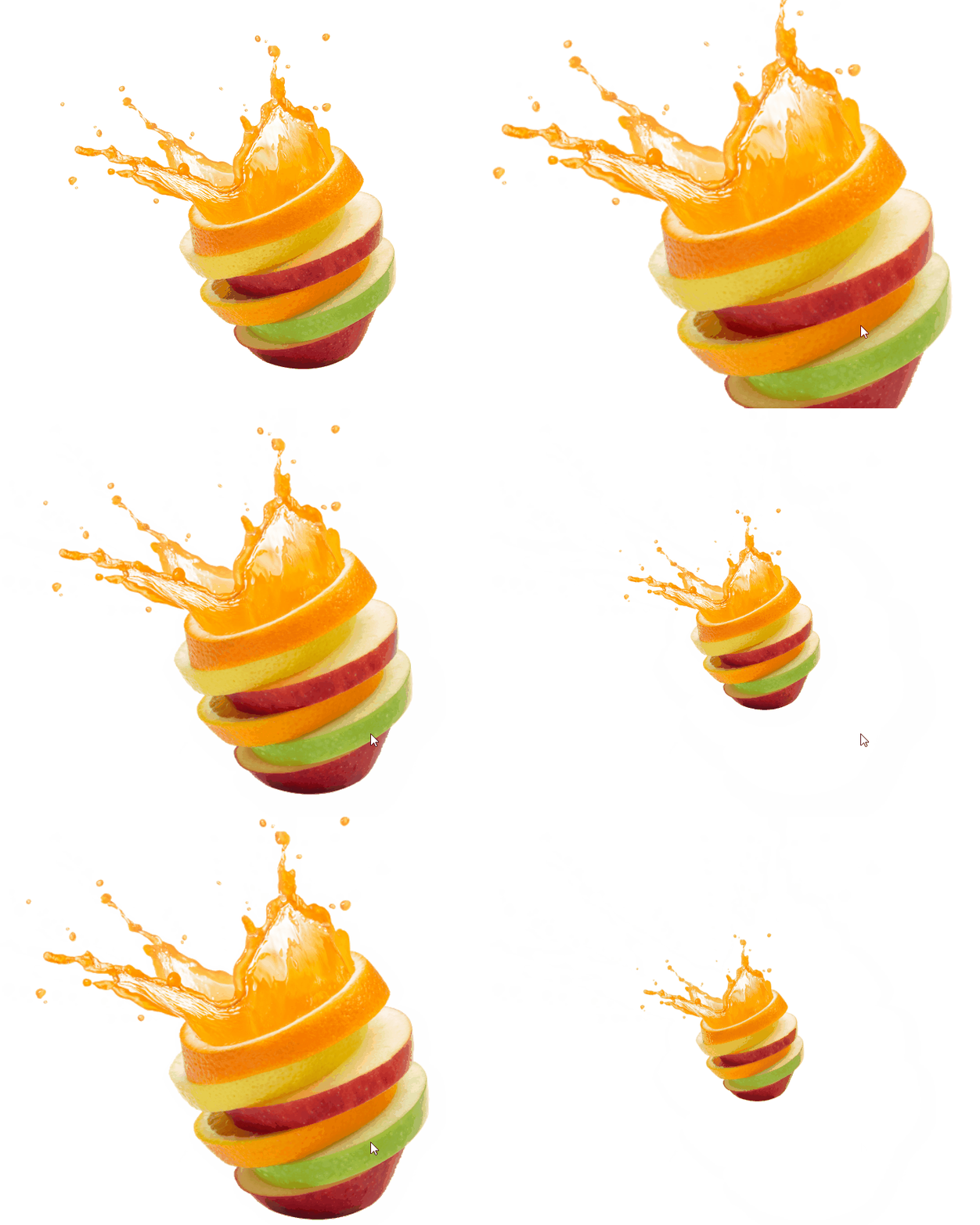
Here is the HTML code snippet for the above:
<div class="zoom">
    <img src="https://lh3.googleusercontent.com/proxy/hxxyEtx6Bbv4H_jVMO1S7bsu4IW0KOk4IXc7PuocKxameQXFY4Zbnrmh2aphFBxD0cBACg0l_lugoMrgbxBivNHVsbaXkzn1pLz7I_yxAS-mfPkt9gvVsGriA0cgkb0dWEzUzA"/>
</div>
The CSS and JavaScript remained the same. This is because the effect is set on the container and not on the individual element itself.
And that is it for today. Thank you for making it to the end.

